Categories
News

Mobile Roadie Teams Up With Arizona Department of Health Services To Build Award-Winning Medical Information App

The Arizona Infectious Disease Resource app wins top honors from Arizona Public Health Association

PALO ALTO, Calif., October 14, 2016 – Industry-leading mobile app builder Mobile Roadie congratulates its client, Arizona Department of Health Services, on winning top honors from the Arizona Public Health Association for their AZ Infectious Disease Resource (IDAZ) mobile app.

Created in partnership with Mobile Roadie, the medical information app took first place in the 2016 Health Education Media Maker Yearly Award (HEMMY) Awards category for health education or patient education material produced in the state of Arizona.

The ADHS IDAZ app provides both health care providers and patients in Arizona with information about infectious diseases including public health recommendations, real-time outbreak alerts and other health announcements in the state. Through this app, providers can reference the app for timely health notifications that directly impact their practice and patient population.

“The IDAZ app will provide significant value to the Arizona community by offering accurate medical information and resources in a convenient way,” said Mobile Roadie CEO Gino Padua. “The innovative approach of ADHS sets a great example for other state leaders across the country who are considering how to leverage the power of mobile to engage with their citizens on a wide range of issues.”

The app offers a wide range of information including:

  • A comprehensive list of infectious diseases and corresponding symptoms
  • Disease testing recommendations
  • Continuing Medical Education opportunities around the state
  • Arizona-specific reporting guidelines and state lab submission requirements
  • A map that allows providers to locate public clinics and health departments and call them with one tap

All of these features are easily accessible through the app’s dashboard, which features a news panel highlighting recent public health events and an intuitive menu of options.

Throughout development, the Mobile Roadie Client Services team worked closely with ADHS to envision and build an app that would fit their specific needs. Building the app presented unique challenges, including uploading and organizing four times the amount of content needed for a standard app. Mobile Roadie also handled all app store negotiations as part of its free submission service.

ADHS officially launched the IDAZ mobile app in summer 2016 during the annual Arizona Infectious Disease Training and Exercise, where it achieved over 200 downloads in a three-day period.

Mobile Roadie and ADHS are currently building an additional application that will provide medical reference information to nurses working in the state of Arizona.

About Mobile Roadie

Mobile Roadie, an app creation and mobile marketing platform, helps users seamlessly build and maintain a customized app designed to suit their needs. The company was launched in 2009 and pioneered the concept of simple and easy app building. In 2015, Mobile Roadie was acquired by Intellectsoft which bolstered the platform’s global infrastructure, product innovation, and client support services. Today the platform powers a range of clients from the Red Hot Chili Peppers, the San Diego Gulls, Universal Pictures and the San Diego Zoo to Tupperware, Arizona Department of Health Services, the Aspen Ideas Festival, Harvard University, Wynn Las Vegas and Hollywood Casino. To date, Mobile Roadie has been used to create more than 500 apps that have been downloaded by over 50 million users. To learn more, visit www.mobileroadie.com.

Follow Mobile Roadie on Social Media:
Twitter    Facebook    

Media Contact:
Sarah Hardy
Director of Communications, Mobile Roadie
sarah.hardy@intellectsoft.net
913.461.1155

Categories
Blog

The Iowa Wild Bring the Action to Their Fans With an App, Just in Time for Opening Night

The Iowa Wild prepared for the 2016-17 season by more than just practicing. The team also busied itself updating their mobile app so that fans will have all-access to the latest news when the Iowa Wild take on the Manitoba Moose in their home opener tonight.

Powered by Mobile Roadie, the Iowa Wild app is a one-stop shop for fans to buy tickets, check game schedules, discuss players, pick up Wildwear, and get up-to-the-minute news.

Photo Oct 14, 8 53 29 AM

Here at Mobile Roadie, we’re proud of the Iowa Wild app and what it brings hockey fans. Some of our favorite features include:

  • Game Track: Get second-by-second coverage and scores delivered by push notifications when you can’t be at the game or in front of a TV
  • Watch Live: Stream live video and audio of the games even while you’re on the move
  • Fan Communities: Want to talk about a hat trick or trade that happened? Open a discussion topic with other Iowa Wild fans!
  • Fan Central: Navigate to the Iowa Wild Twitter, Facebook, Instagram, and Youtube account with a single touch
  • Photocards: Nothing to do during intermission? Take a picture in one of the official Iowa Wild picture frames until the action begins again!
  • Merchandise Store: Rep your team by ordering gear from the Wildwear store

Photo Oct 14, 8 53 54 AMPhoto Oct 14, 8 54 50 AM

So download the app and stay up-to-date all season long. Best of luck to the Iowa Wild – let’s start the season off with a win!

Categories
News

Is There Room for Apps in Church? We Joined Christianity Today to Talk Tech and Religion


We recently had the privilege of speaking with Christianity Today about how churches can embrace mobile apps and further engage their members. Check out the full interview here:

http://www.christianitytoday.com/local-church/2016/september/church-apps.html
Categories
Blog

5 Things You Absolutely Need to Build a Mobile App

If you’re here, you’ve probably already gone through the 6 questions you need to ask before getting a mobile app and decided to join the mobile revolution. It’s an enormous task for both technical and non-technical people alike but don’t worry, you’re on the right track and your business will “app”reciate you for it later.

It’s time to think about exactly what is going into your mobile app. This is perhaps the most important part of the app building process as by the end of it, you’ll be connecting with your users for the first time via mobile. Here’s what you HAVE to have down before you start developing.

1. PURPOSE

This is the easiest and hardest item on the list. Easy because it should already reflect everything your business or brand has already done to get here. The devil, however, is in the details and that means that the purpose of your app should somewhat be different from what your website is already doing. Ask yourself:

  1. What problem does your app solve and how are you solving it differently?
  2. If your app doesn’t solve a problem (think games or Spotify), what value does it add to your user’s life whether as a service or entertainment?
  3. What conveniences do you want to offer with your app that can’t be addressed on a PC?
  4. What in your strategy and delivery sets you apart from everyone with this app?

The success of the rest of the items on your list are contingent upon your app’s purpose so this is usually the longest step to get right and often needs to be revisited throughout the process. Aim to make your app describable in a 1-2 sentence snippet. After all, you can use the description when you submit it to the App or Play store later.

2. CONTENT

Websites are great at delivering a lot of content. Apps are better at delivering accessible, need-to-know-now content. That means that the amount of information that you put in an app should not be overwhelming and certainly should not be a translation of your website. Things like a subscription page or a “meet the team” page can be scrapped for the sake of simplicity and efficiency. Your app should serve as a corner store in your user’s phone so making services and support accessible with “one tap” is crucial.

There’s a positive correlation with good content and amount of “time spent in app”. Since content is king, it’s important to make sure of the following things:

  • Make your content relevant. That means putting scores up on the homepage of your sports app or making an interactive venue map accessible in “two taps” if you’re a conference organizer.
  • Put pertinent information at the top. Readers have a shorter attention span when they’re in need of critical information. This is doubly true when you they’re on-the-go reading from their smartphones. Make sure you answer or provide relevant information within the first paragraph or two of each page.
  • Short and concise. When your screen is 5 inches tall and 2 inches wide, it’s difficult to read blocks of texts. Tighten your writing and deliver short, powerful messages in 2-3 sentences at a time.
  • Images > text. Studies show that mobile users stare longer at images and videos than text itself. This doesn’t mean you can’t have written content but you should be using visuals either as a background for your text, a break from it, or a way to explain to the user what they’re reading.

3. DESIGN

Your app should an extension of your brand. Everything your design team implements, from your logo to the placement of each feature,  should account for user experience. Here are some design tips that Mobile Roadie uses to ensure the best UX experience possible:

  • Understand the capabilities and limitations of the hand. We optimize tab navigation so that it’s one-hand and thumb-friendly.
  • Use the “3 tap rule”. Some complex apps have a lot of content but Mobile Roadie adheres to the belief that every piece of content should be accessible in 3 taps. From the home screen, we ensure that each section has a maximum of 3 tiers of categories so that users can intuitively navigate through the app.
  • Utilize obvious call-to-actions. All of our apps use an attractive navigation bar at the bottom of the screen that’s thumb-friendly and directs users to the features of an app like an activity feed, interactive map, search bar, or support page. It ensures that your users are getting the most out of the app by calling their attention to navigation buttons.
  • Map out everything manually. Create wireframes, layout user stories, and chart experience maps to understand the motivations and feelings of users when they see a screen or interact with a certain feature.

4. TARGET AUDIENCE

Knowing off the bat who your users are (age, gender, location, demographics) will allow you to design and create content appropriately. If you own a single-purpose app (think of when Facebook made Messenger a stand-alone app), your audience might be those who need to access it quickly and often so cluttering it with excessive content or a complex design won’t work.

You can get a better grasp of your audience by creating personas (imaginary characters made up by the expected interactions with your app) and user scenarios (imaginary situations and what people would do step-by-step to solve them).

Sometimes, you might have two different audiences. Take for example, an app created for a school and meant to be used by both students and parents. The former might need a map of the school, schedule of classes, and sports schedule while the latter might need access to report cards, school forms, and parent-teacher conferences. In that case, Mobile Roadie ensures that both parents and students receive group-specific information and have access to shared news by creating accounts for every user. This way when each user logs in, the app will populate content specific to the student or parent.

5. MVP

No, we’re not talking about the most valuable player although you’re pretty awesome. The minimum viable product is the absolute bare bones release of your app limited to only its basic features. It is one of the most valuable (see what I did there?) tools to receive the initial round of reviews and comments so you know what direction to improve in before continuing with development. Mobile Roadie actually developed an app that allows you to preview what your app looks like in real time and experience the features for yourself. Called Mobile Roadie Connect, our version of an MVP “app previewer” also helps you figure out:

  1. How easy is it to use your app?
  2. What fixes do you need to make to bugs found in the MVP?
  3. Does your app still align with business and customer values?
  4. Is your app ready for the app store?

The best way to ensure that your app will continue to get downloads once in an app store is to revisit your purpose. After you’ve reached the end of this article, go back and make sure that your content, features, design, and product all fit with the problems you want to fix or the services you want to provide in people’s lives.

If you’re ready to build an app or have a question about anything you’ve read above, Mobile Roadie has a budget-friendly, low-code app approach that could power your new mobile app. Our new Client Services division is dedicated to helping prospective clients get their app off the ground and into the app stores so contact us when you’re ready!

Categories
Blog

I Got an App in Ibiza: Pacha Goes Mobile


I Got an App in Ibiza: Pacha Goes Mobile

About 90 miles off of Spain’s Eastern coast, in the Mediterranean Sea, lies a beautiful up-cropping of land about ten times the size of Manhattan. The island is Ibiza, and to most of the world, its name is synonymous with partying. Though the total population of the island is only around 140,000, it draws nearly 14 million visitors a year.

Revelers who come to Ibiza are nearly unanimously wowed by their experience. The summer party season, which runs from May to September, draws the biggest DJs and clubbers from around the world. For those who run in certain social circles, partying in Ibiza is a lifestyle statement.

But everyone who participates in the Ibiza party experience agrees: there is something uniquely beautiful about the connection, sense of community, and openness that graces the island. Ibiza brings together people from around the globe just looking to cut loose and have fun.  


Club Pacha

Naturally, the island is host to a number of legendary clubs, each with its own niche. Perhaps none is more legendary than Pacha, a place where patrons can experience a “summer of love” vibe with an updated soundtrack. The club’s resident DJs include David Guetta and Martin Solveig, and Diplo and Mark Ronson will be among the guest performers this summer.

In addition to a nightclub, Pacha has two hotels and shops on the Island, making it possible for vacationers to experience their entire trip through the group. As Pacha’s website attests, those who party at Pacha love to document and share their experience. After all, for most visitors, their trip to Ibiza is a rare thing.

With this in mind, Pacha was faced with a dilemma: how could it bring together patrons whose club experience may only be as short as a night?


From Ibiza to iTunes

By designing a mobile app, Pacha effectively solves this dilemma by bringing its presence out of Ibiza Town and into our pockets. Fans of the venue can stay connected to it even once they get back to their cubicles and living rooms. After all, the Pacha experience is supposed to be more than a night of partying.

By connecting these bon vivants through a mobile app, Pacha allows itself the opportunity to grow beyond just a nightclub. Instead, they create an interactive community. Mobile users can connect, share their experiences, and submit photos and videos. In strengthening these bonds, Pacha itself builds a more dedicated and active community.


Feeling the Beat Beyond the Dancefloor

Pacha’s attractive new mobile app, powered by Mobile Roadie, offers club-patrons (and aspiring patrons) a place to come together. With a fan wall, a magazine, and a chance for users to create personalized profiles, the app is both a way to stay up to date on happenings and socialize with others. Throw in an “Events & Tickets” link, and users needn’t even leave their application if they’re suddenly inspired to buy entry to one of the club’s many events.

Here are a few of the ways the app brings users together while promoting Pacha:

  • The fan wall has a section for comments, a map so that users can see where other fans are posting from, and a photo section for user submissions. On a recent weekday, Pacha diehards from Buenos Aires to Brussels excitedly shared about upcoming trips, guest-lists they would like be on, and DJs they couldn’t wait to see.
  • It encourages interactive participation by having users create a profile and accumulate points to become a Top User by offering top-rated comments, posting photos , and participating in discussion forums. A leaderboard shows how many “points” top users have accumulated. Peer-to-peer messaging allows for the app to function as a social network as well, with club-goers linking up on their phones.
  • User-generated content also gives the app a community-driven feel. Users submit photos (at an increasing rate as the #pachalove promotion draws to a close) of themselves living it up at Pacha. Photocards are a fun chance for mobile users to photoshop themselves into various Pacha themed pictures and post them to the gallery.
  • The newsfeed offers not only updates, promotions, and new line-ups, but also interviews with resident DJs. Subscribers to the newsfeed can receive push notifications and updates. During the summer party season, when new DJs are constantly being added to the events calendar, this feature is particularly useful.
  • Draw competitions and surprise promotions, both available only to the app’s users, gives fans a chance to make it onto exclusive guest-lists or into impromptu parties. Using geotargeting, the app knows when a user is on Ibiza, and will offer him tips for his trip. For those involved in the club scene, entry to these exclusive parties is a huge bonus of downloading the app.


What’s Next

Mega-clubs, both in Ibiza and elsewhere, would be wise to follow Pacha’s lead and consider making the leap from party-venue to lifestyle brand. What Pacha has done not only ensures continued interest in its club events, but also increased awareness. Promotions such as the photo submission contests give it a strong presence on other social media platforms as well.

What do you think? Is Pacha leading the way in what’s soon to become a bigger trend? Where else do clubs and other venues have room to grow online? Let us know what you think of Pacha’s app in the comments!

Categories
Blog

Church Isn’t Just For Sundays: CrossPointe’s Mobile Presence

Sundays have different meanings for all of us. Football, family, time and a half at work. One or all of these things might sound familiar to you. But for fifty million Americans, Sunday is still the day of worship, and you’ll find these folks spending the morning of the seventh day in church.


Church is where we connect with one another, get to know our community, and come to feel like a part of something larger than ourselves. It’s a place we can get to know our neighbors, coworkers, and ourselves.

Though church attendance has declined somewhat over the past century, it remains a core tenet in the lives of many of us. It’s still a part of our national fabric.

Apps Can Divide Us…Or Unite Us

So naturally, the question is, how can church compete with our new favorite means of connecting – via social networks and mobile apps? More than a few churches have had to contend with over-eager smartphone users in the congregation. After all, we are constantly on our phones: one recent study shows that we spend an average of three hours a day on our mobile apps. The problem here is larger than sneaking a game of Candy Crush from the pew. The way the we connect is changing, and it’s moving away from the highly personal style that is inherent to church.

That’s where mobile church applications come in. We already enjoy the information, connection, and entertainment that smartphones offer. Working off the assumption that this will not change, the only variable is how we spend our time on the small screen. Ironically, the same medium that causes us to socially isolate ourselves, can also be used to draw us together.

Because churches and mobile applications are actually a near-perfect match with community-building lying at the heart of both. The difference is, that although churches create a sense of community, most members of the congregation will only interact with their church once a week. By utilizing mobile applications, a church can build resilient bonds between its members.

The CrossPointe Way

CrossePointe Church, located in Valdosta, GA and Quitman, GA recognized this opportunity early on. Headed by Pastor David Rogers, CrossPointe Church emphasizes the importance of connection, both with God and with other church members. Since 2005, the congregation has grown from twelve worshippers meeting in Pastor David’s home to thousands of worshippers gathering every Sunday at two churches.

The CrossPointe church uses tailored events and programs to reach out to children, college- aged young adults, men, women, and people recovering from substance abuse. In July alone, CrossPointe is offering a student conference, a weeklong bible camp, and a grocery drive, not to mention the church’s other weekly events. With so many unique groups coming together, congregants need a way to keep up with events.

Another reason CrossPointe is the perfect fit for a mobile app is due to the service being spread out over multiple locations. Without the app, church members are unable to hear both sermons, or know the stories of all of their fellow worshippers. By using its mobile app to connect with its congregants, CrossPointe is truly living up to its promise spread the Word.

Great features of the app

CrossPointe’s new app offers church-goers the opportunity to take their involvement with the faith community on the go. With a sleek design and user-friendly dashboard, CrossPointe’s app has users church needs covered. Scrolling through motivational articles, members’ stories, and a packed calendar, it’s clear that the church has successfully built a mobile community that mirrors its real-life counterpart.

A few of the app’s highlights include:

    • To enhance members’ churchgoing experience, the app offers notes, a more in-depth exploration of each Sunday’s sermon. Users can look at recent topics – for example, “Greater Than: My Worry and Anxiety” – and follow along with supporting parables and verses from scripture.
    • The app also offers congregants a calendar and Twitter feed so that they can stay up to date with goings on. The Twitter feed is full of short motivational message from pastors and other members of the CrossPointe family. The “Full Church Calendar” is so packed that it’s quite clear why the ability to access it from an app is a must for active church members.
    • For those who can’t make it on Sundays, or are curious about their sister congregation at CrossPointe’s other location, video and audio of sermons is available to the app’s users. Also available are personal stories and videos in which CrossPointe members testify to how their involvement with the church impacted their lives.
    • Links to Christian music, which automatically connect to iTunes, give app users the chance to get into the spirit while working out or in the car. And if they should happen to be driving to church, they need not worry about getting lost, as the app offers a map with both locations, as well as the ability to “check in” on Foursquare.

What’s next

Churches with congregations numbering in the thousands should take after CrossPointe’s example and consider a mobile application of their own. The faith families built at church usually only gather once a week. By connecting its members through an app, a church not only continues to spread its message, but also builds bonds among its members. It’s a perfect chance for users to carry their faith in their pockets.

So, how about it? Do you think others will follow CrossPointe’s example? How might churches add a social-networking aspect to their online presence? Give us your thoughts in the comments!

Categories
Blog

App Store Optimization: Take Your Game to the Next Level

If you’re a software or mobile app developer with some experience in the industry you’re probably familiar with the acronym SEO, or “search engine optimization.” But for those dedicated to taking custom mobile app development to the next level, there’s a new three letter word that may prove more valuable: ASO – “app store optimization.”

More than ever, consumers are discovering new apps by browsing and searching within the app store. It’s by far the most popular discovery method, accounting for 63 percent of app discovery among iOS users and 58 percent among Android users.

In app store searches are twice as popular a discovery method as the ubiquitous “most popular” lists. This means new kids on the block have a chance at competing with recognized players…if they understand and utilize ASO.

But no matter how genius and groundbreaking your app, without ASO utilization there’s a chance it will go completely overlooked. It’s a lesson that every successful mobile app development company has already learned: it’s absolutely critical to ensure that your creation is tailored to the medium it will be sold through before it hits the marketplace.

On paper, the process is simple: (1) get discovered, and (2) capture consumer interest. Once you do these two steps right you’ll be 90 percent of the way there. In practice it gets a bit trickier. But if you can successfully incorporate the following fundamentals into your app design, you’ll already be beating the competition at ASO.

  • Keywords. Use these in the title of your app in order to cast the widest net and catch the most search traffic. According to a study of the top 25 most popular apps for sale, including a keyword in the name of an app increased its ranking by an average of 10.3 percent.
  • 25 characters or less. Any longer than this will no longer be viewable on the preview in the app store. Having your title chopped off is unattractive and will make a consumer – especially one with a short attention span – move on.
  • If it ain’t broke, don’t fix it. If you’re reading this once your app has already gone to market and feeling inspired to change the title of you app…don’t. Once you’ve already gained traction, it’s best to stay the course in order to create name recognition and word-of-mouth buzz.
  • Understand long-tail. Long-tail keywords, which appear in your app’s description, offer another great opportunity for discovery. If you want create a communal carpooling app, you probably shouldn’t call it “carpooling.” But by including that phrase in your description, you’ll capture all app store users who search that term.
  • Be a genre trailblazer – More often than not, app store users don’t search for a specific title, but instead a genre – e.g., “maps” or “music.” In fact, searches by genre account for 80 percent of all searches. By getting out ahead of the curve and anticipating a genre that will be popular but is not yet oversaturated, your software development company can vault its app to the top.
  • Appeal visually – Your icon should have visual appeal and somehow describe what your app does. Snapchat’s playful ghost speaks to its ephemeral photos while Tinder’s red flame suggests a spicy fling. Once you’ve put your idea into words, create a descriptive visual as well.

If you can effectively apply these tips to your own app, there’s a bonus on the back end: the more downloads your app achieves, the higher it will rank. It’s a classic case of success breeding success – app store algorithms recognize what consumers react positively towards and attempt to give them more. A great app development company is one that recognizes the importance of beating the algorithms.

So keep plugging away with your app, but make sure that you don’t sell yourself short during the final step of the process. Don’t forget to do your ASO!

Categories
News

Mobile Roadie Website Relaunch

Mobile Roadie clients and friends,

We are thrilled to debut our redesigned website today, featuring an all-new list of customized app development tools engineered for a variety of businesses and verticals in mind, ranging from sports teams and conference organizers, to religious organizations and bands.

As part of our website relaunch, we wanted to share two client success stories with you, featuring the world-famous Pacha nightclub in Ibiza and the immensely popular Broadway show, Spider-Man: Turn Off The Dark.

From our first conversation with the Pacha team, we knew our partnership would be something special. As one of the world’s premier nightclub and event brands, this team creates social magic and unforgettable moments for clubgoers. We were thrilled to be a part of it! Pacha finds Mobile Roadie’s geo-fencing capabilities to be the most useful feature of their app. Utilizing their users’ location information they can send targeted notifications about upcoming events, as well as send push notifications to their devoted  fans when Pacha organizes parties abroad (like Pacha’s Festival Amsterdam in fall 2015). The Pacha team also mentioned that Mobile Roadie makes it very easy to update their app on-the-fly, which is a “must” since they never know when the perfect party opportunity will pop up.

Since its launch in January 2012, the Spider-Man: Turn Off The Dark app has been downloaded almost 3.2 million times, serving as a testament to just how much this show has captivated Broadway and Spider-Man fans alike. While the app offered users exclusive information, photos, and updates, most importantly it provides the show with an opportunity to bring users the music they love. This in turn drove over $5,600 of music sales from within the app, creating a win-win scenario for both the cast and the fans.

This website redesign is just a small part of many exciting changes we’ll be rolling out in the coming months, including new themes, a wider range of color selections, beautifully updated designs, increased security features and app code optimizations. Keep an eye out for future announcements in the coming weeks and months! Cheers from our team in Los Angeles and happy app-building!

Categories
Blog

App of the Week: Matchbox Twenty

Matchbox Twenty has been on the music scene for nearly two decades with smash hits like “Unwell,” “Push,” “3AM,” and of course, “Smooth” (feat. Rob Thomas).

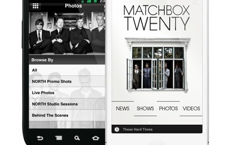
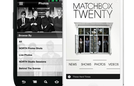
Last fall, we featured this band as our App of the Week to celebrate the release of their 4th studio album North and the start of their tour. In addition to AR technology (which we mentioned in the first App of the Week post), Matchbox Twenty has added another cool feature to their app that’s getting quite the buzz – geo-fencing, which is the “ability to sense where concert-goers are within the venue.” Geo-fencing is one of the newest and most exciting features we offer to our customers.

VP of Lippman Entertainment Nick Lippman said, “We can talk to fans as they come in and out of the venue, welcome them to the show, give them a hashtag to participate. It’s a great way to get information to people without being uber-intrusive but also remind people what they can do to be an interactive part of the show. We’ve had killer fan engagement.”

If you’re catching a Matchbox Twenty show in the upcoming future, don’t forget to enable notifications on your Matchbox Twenty app to receive geo-targeted messages. To read more about Matchbox Twenty’s foray into geo-fencing, check out the coverage on Billboard.com. And to download the app, visit Mobile Roadie site.

Categories
Blog

App of the Week: Alternative Press Magazine

From humble beginnings to becoming one of the top music magazines in the US, Alternative Press has been covering the underground music scene for close to three decades.

With cover stories on some of the most famous acts like the Beastie Boys, Red Hot Chili Peppers, and Green Day, it’s no surprise that AP’s viewer base grew over the years, currently reaching close to 1 million viewers a month.

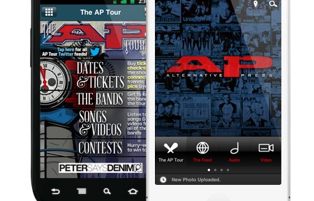
Earlier this year, Alternative Press released their iPad edition to rave reviews – it was heralded as one of the “best-designed digital publications on the Mag+ platform. And now they’re back with their very own mobile app designed for the iPhone and Android.

The official AP mobile app is the perfect place to keep up with all the latest from the magazine. You can browse special events in real-time via LiveStream and Ustream, connect with other AP readers, listen to music, and so much more!

Download the official AP app at http://road.ie/altpress 

Categories
Blog

App of the Week: Matchbox Twenty

Matchbox Twenty has been on the music scene for nearly two decades with smash hits like “Unwell,” “Push,” “3AM,” and of course, “Smooth” (feat. Rob Thomas).

Their 4th studio album North released in September of this year produced another hit single, “She’s So Mean.” To promote their latest tour (scheduled to kick off on January 29th in Tulsa, OK), which promotes their newest album in 5 years, they have released their official app powered by Mobile Roadie.

Fans are in for a treat when they download the app. Integrating Augmented Reality technology from our newest partner Daqri, the Matchbox Twenty app delivers a 4D experience to users who scan the image below. Paul Doucette, the band’s drummer, says they’re “always looking for cutting edge ways for fan experience to be better, and with the 4D technology launched, [we] can do that from a music side, touring side, and a direct fan encounter.”

Daqri’s CEO Brian Mulllins added that the app “is an incredible way for fans to access stunning 4D content, interact with the band in the palm of their hands, view concert dates, buy tickets right from the experience and even get a chance to meet them in person.”

Download the official Matchbox Twenty app at Mobile Roadie.

Categories
Blog

Red Hot Chili Peppers Give Away Front Row Tickets to App Users

We’re always on the lookout for interesting marketing campaigns that are going on inside our apps, and we think we’ve found a great example of how you can use your app to boost user engagement and increase downloads.

The Campaign

Leave it to the Red Hot Chili Peppers to create a marketing campaign inside their mobile app that is sizzling (and ridiculously simple, yet genius)- they’re upgrading concert tickets to FRONT ROW seats for some lucky fans inside their app. Here’s how the promotion works:

1) Fans who have tickets to a RHCP North America Tour show can enter themselves in the promotion by going inside the Tour section in the app, finding the show they have tickets for, and clicking the “I’m Going” button.

2) One winner is selected at random to receive 2 (!) front row seat upgrades. They are notified two ways – via Direct Message which can be found on their User Profile and via a targeted Push Notification.

To promote this campaign, they posted the details in the blog section of their official website and on their social network sites including Facebook:

The RHCP team also promoted the campaign in their mobile app with push notifications that were sent out to users:

The Results 

Needless to say, the campaign has created happier fans, higher app engagement, and more downloads. By creating promotional campaigns that reward users for activity – even an activity as simple as clicking a button – buzz is generated and the relationship between brand and fan is strengthened.

The RHCP campaign is an excellent example of how you can incorporate multiple features of your mobile app to create a marketing campaign that is simple, yet highly effective.

Categories
Blog

The LA Kings win Mobile Excellence Award for Official Mobile App

Congrats to the LA Kings, 2012 Stanley Cub champions, for winning a Mobile Excellence Award in the category “Best Mobile Entertainment For Sports” for their mobile app powered by Mobile Roadie!

Since 2008, the Mobile Excellence Awards has recognized the best in mobile entertainment and technology. Winners include Walmart, Fandango, Fox Digital Entertainment, Disney, Marvel Entertainment, and Mercedes-Benz.

This year marks the first appearance of the “Best Mobile Entertainment For Sports” category, and what better form of mobile entertainment than the LA Kings mobile app! The team triumphed over heavy-hitters like EA, FIFA 12, StepLeader, Duck Commander, and Wrestlemania XXIX Sweepstakes to bring home the award.

Jonathan Lowe, AEG Sports VP of Marketing, commented on the win, “We’re proud to be honored for our LA Kings Mobile App powered by Verizon. By leveraging the Verizon network, we’ve launched innovate live video services that set us apart and provides fans great value. Our technology partner, Mobile Roadie, did an excellent job, along with our in-house team of Dewayne Hankins and Pat Donahue. And, of course, we appreciate Verizon, whose support helped make this App possible.”

Congrats again to the LA Kings, and a big “Thanks!” to the Mobile Excellence Awards for the honor.